Sunday, September 30, 2012

Barbapapa?

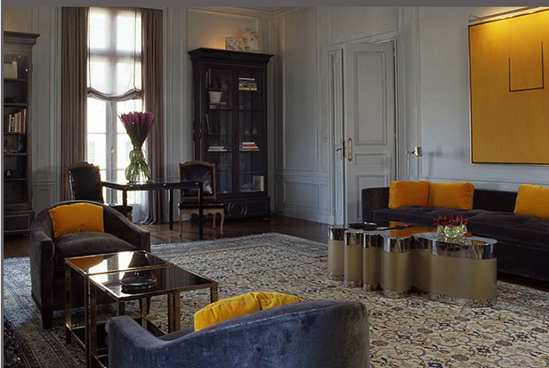
Browsing through my google reader today I was introduced to the beautiful work of Jay Jeffers through one of my favorite blogs La Dolce Vita.

I loved the style of Jeffers and this bedroom in particular which reminded me of a very nice hotel suite.

 First was this, very nice

Then this, really nice

Then this !! 

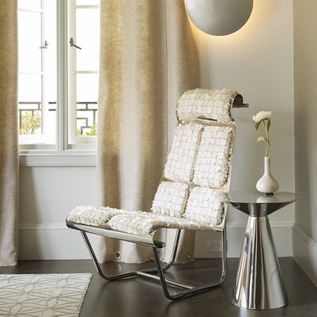
What are these two chairs exactly doing in this room? They reminded me of Barbapapa, if anybody is old enough to remember him. 

The chairs aside the work of Jeffers Group is outstanding do visit them.


Wednesday, January 25, 2012

Beautiful Libraries


I was so happy to discover a website completely dedicated to libraries. I am a book lover and going into a home that has a lot of books just makes me feel warm and some how closer to the owners. I also love designing libraries and it is always a nice challenge to come up with something different, warm and inviting and at the same works for the owner's needs.

For inspiration, Beautiful Libraries is a great place to start, it is even organized in a nice way.

Images via Beautiful Libraries.com

Monday, December 26, 2011

Merry Christmas

It has been a while since I posted. Will be back to normal soon.


I wanted to thank all my online friends for their support this blog has been an amazing experience for me.
Merry Christmas to all and hope 2012 is a beautiful year. Not the end of times, but the beginning of great new experience.

Thursday, November 3, 2011

Volpe

Every once in a while you see photos that really make your heart jump. Sometimes you know what it is and sometimes it is just this inexplicable feeling, and this is what happens when I look at Steven Volpe’s work.
3
2
4 1  
All photos from Volpe’s website, do visit to view more beautiful work

Sunday, October 9, 2011

Square 9

… I like it

Sq1 

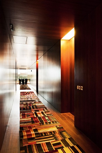
Sq2Love this minimal reception desk

Sq3

Sq4

I like almost everything about The Square Nine, but I really don't think this runner is the most practical thing for pulling those heavy suitcases, or even walking after a loooong evening out, if you get my drift !

Images Via Yatzer (here)

Sunday, October 2, 2011

Mirrors….Confusing ?

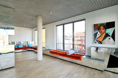
Lately, I have seen a lot of pictures of this penthouse in Berlin on many blogs and websites. At first I was very neutral about it, but the more I saw it the more it felt cold, and honestly a bit confusing, but then again lots of mirrors do that to me !

I imagined the grey skies of winter in Berlin all reflected inside my apartment and it felt even colder. Do you like ? Dislike ? More on (here)

Berlin 2  Berlin 1

Berlin 3

Tuesday, September 27, 2011

Fashion & Crystal

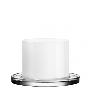
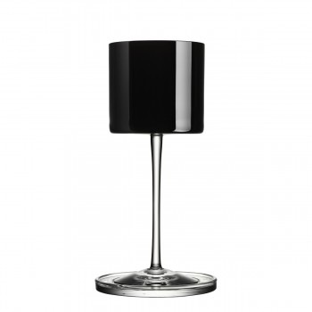
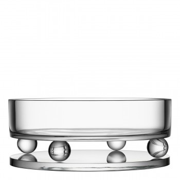
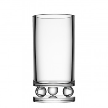
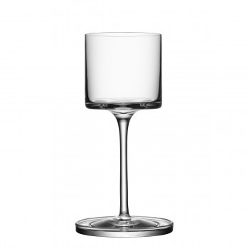
One of my favorite glass and crystal companies Orrefors has teamed with Karl Lagerfeld to create a new collection. The result, beautifully elegant designs, just like his clothes.
6590532_kl_with_coaster

6591032_kl_with_coaster 6590432_kl_with_coaster


6590418_kl_with_coaster

6590518_kl_with_coaster


6590413_kl_bowl_round

6590423_kl_vase_round

Thursday, September 22, 2011

More From Gary Hutton

As promised in my previous post, here are more photos from the work of Gary Hutton. I really like his work and there is this seamless quality that permeates throughout his projects. They are just beautiful to look at.

Schreyer-TiburonRes-6-528x530 

06_eb-528x528 

14_loft-528x528 

fs_01-528x528 

fs_10-528x528 

Schreyer-TiburonRes-3-528x530 All images via Gary Hutton website

Wednesday, September 21, 2011

Gary Hutton

I have always loved the beauty of Gary Hutton’s designs. They are so elegant, but more importantly they invite to feel good. Don't you think? I admire the designs so much I will dedicate more than one post for his work.

GH2

GH1I would like to know more about this chair

GH3Great wall treatment

Sunday, September 11, 2011

Sexy Curvy

Vivian Beer

I like the curves of Vivian Beer’s “sculptural pieces. Some would argue that they are not comfortable, I would argue that not all furniture should follow function, sometimes form maybe the whole point.

I would not mind having this piece in a room on the side under a huge abstract painting. Visit her website for more beautiful sculptures.

Wednesday, September 7, 2011

2Michaels

I really, really like the work of the design studio 2Michaels. I like their palette, the sophistication and most of all the “natural” styling. the homes seem to be lived in and personal. Not dry and staged. Hope you like them 2.

res_sutton_g 

res3

res_sutton_b

kipsbay_cvr  res5  res10a  res43 res44

All images via 2Michaels website

Saturday, August 27, 2011

Inside Out

Beautiful modern architecture bringing the outdoors indoors. I am sure this was styled for the photo shoot, I would add a bit of warmth without drastically touching the interior, still it is beautiful as is. What do you think ?

HH2

HH1 Source

Thursday, August 25, 2011

Loving A Lamp !

Yes I am , it reminds me of an elegant lady wearing a big hat.

cr2 

cr1Designed by QisDesign Via

Tuesday, August 16, 2011

Fix Your Teeth

Wouldn’t it be fun to go to this dentist. I bet their magazines are also up to date.

Dental Inn 2

Dental Inn 1

Dental Inn 3Source